


 5
5 Like
Like Share
Share
 Report
TL;DR export the chart, find the line of xml which reads as follows, and add IsValueShownAsLabel="True"
<Series ChartType="StackedColumn" Font="{0}, 9.5px" IsValueShownAsLabel="True" LabelForeColor="59, 59, 59" CustomProperties="PointWidth=0.75, MaxPixelPointWidth=40" />
If you'd like a step-by-step, read on!
Why use a stacked bar chart?
Stacked bar charts are useful for grouping data that are easily categorised. Take for example the statuses of Leads and Opportunities: Qualified, Disqualified, Open, Won and Lost. Each entity only has a few statuses, which makes for a clean chart.
The following example displays opportunities created per day, grouped by their status:
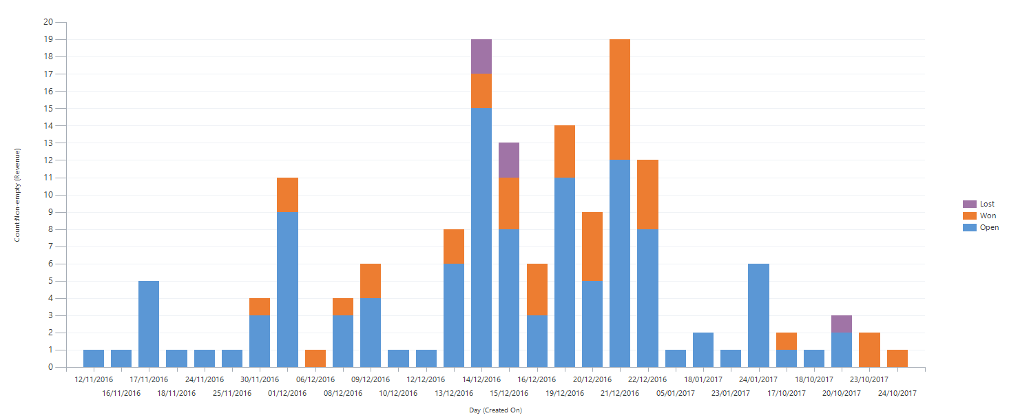
The view itself is visually very informative, with each opportunity category displayed as a different colour. Clicking each individual bar drills down to display records of the chosen status in a separate view.
One enhancement, however, which is not customisable through the chart editor, could be the addition of a record count for each bars groups. In that way we'd be able to see how many open, won and lost opportunities we have per day at a glance without having to select each column.
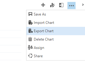
To achieve this, we'll need to export the chart, edit its underlying xml code, and reimport the chart.
Step-by-step:
- Step 1: Export the chart
- Step 2: Edit the xml
Open the xml file with a text editor such as Notepad, Notepad++ or Visual Studio Code. Locate the line which begins Series ChartType= .. then add IsValueShownAsLabel="True"
<Series ChartType="StackedColumn" Font="{0}, 9.5px" IsValueShownAsLabel="True" LabelForeColor="59, 59, 59" CustomProperties="PointWidth=0.75, MaxPixelPointWidth=40" />
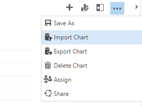
- Step 3: Import the chart
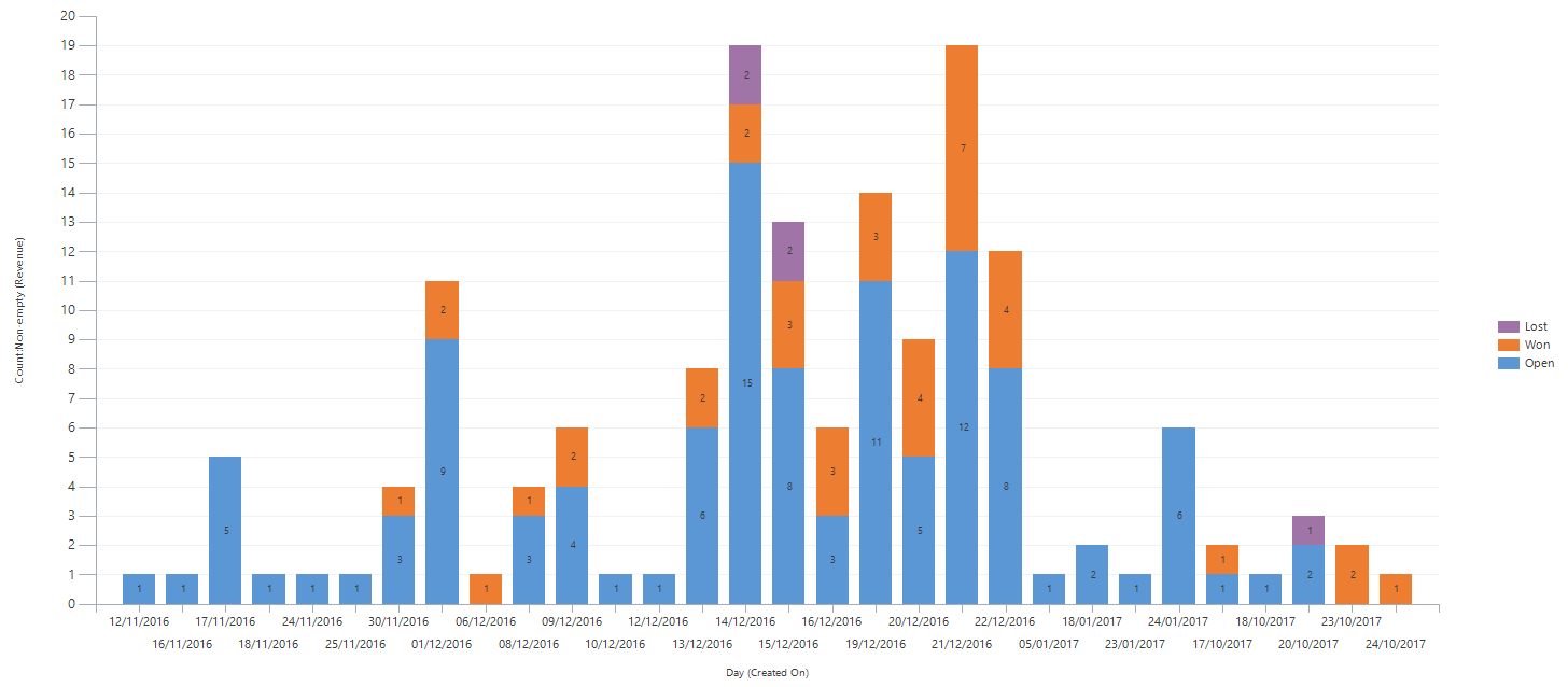
That's it! Observe that the complete version displays a number on each bars groups, showing how many records are won, lost and open:
*This post is locked for comments