Hey community,
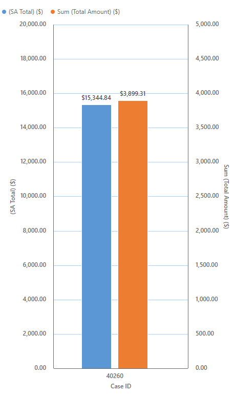
I'd love to have matching scale values along the Y-Axis when I have dual Axis series (Legend Entries(Series))
The scale is not the same, so the values in the bars are not like and gives a distorted visual comparison.
Any way to fix this?

But who owns Charts? The Dynamics team, the Power Apps team, possibly the SSRS team or maybe someone in the Excel team???
cheers,
Dave


