Hi all,
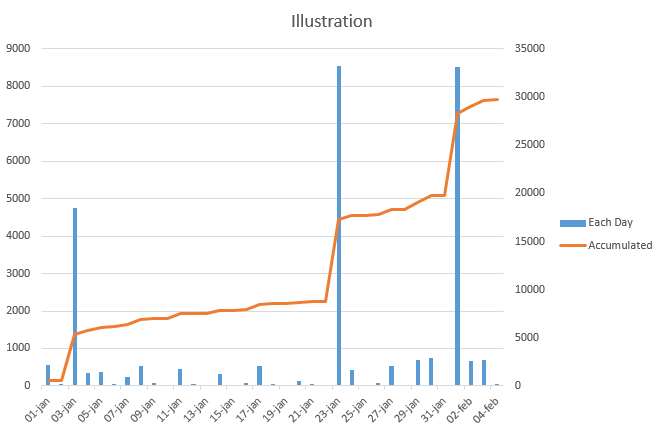
I'm trying to create a chart which shows the sum of actual revenue for each month last 12 month with columns. But I would also like to have in the same graph a line which shows the accumulated value. Is this possible? Any help is much appreciated. The attached image is just an illustration made in Excel to exemplify this.
*This post is locked for comments
I have the same question (0)


