web
You’re offline. This is a read only version of the page.
close
Skip to main content

Notifications

Announcements

No record found.

Community site session details

Community site session details

Session Id :
Microsoft Dynamics 365 | Integration, Dataverse...
Answered

Creating charts

(0) ShareShare
ReportReport
Posted on by

Hi everyone,

i have created some charts and every time I change the chart type for e.g. from column to line graph, it automatically changes the other charts I have created. I don't think I am fully understanding how charts work so some insights from everyone would be greatly appreciated!

I have the same question (0)
  • Microsoft Profile Picture
    on at

    May I know where you can create charts? and the steps on create chart?

    it seems the setting if for all the chart? you may need to find the setting for the specific chart.

  • Community Member Profile Picture
    on at

    Xorisa,

    You won't find that answer here. This forum is for the Microsoft Dynamics Augmented Reality product called "Guides". Its not a general guide forum. You will want to find the forum for the Microsoft product you are using to get your charts answer.

  • Community Member Profile Picture
    on at

    Jasmine,

    You won't find that answer here. This forum is for the Microsoft Dynamics Augmented Reality product called "Guides". Its not a general guide forum. You will want to find the forum for the Microsoft product you are using to get your charts answer.

  • DavePinch Profile Picture
    on at

    Hi xorisa, I'm sorry for the troubles. I see you tagged this thread as CRM so I will move it to the CRM forum for better visibility.

  • Community Member Profile Picture
    on at

    Thank you, Dave (and everyone else). I am new to the community so apologies for posting this in the wrong forum. 

    I am creating charts via 'Show Charts' and then under a specific view, I generate charts. However, every time I want to use a different type of chart, it changes every single one of them. This includes with if I want to include more categories for the x or y axis.

    Your advice is greatly appreciated.

  • LuHao Profile Picture
    40,892 on at

    Hi xorisa,

    Could you provide some screenshots?

    Can you tell me whether you are using D365 online or on-premise? If it is D365 online, which app are you using?

    We should change the chart type on the right side of Legend Entries (Series), as this screenshot.

    5123.pastedimage1607412891172v1.png

  • Community Member Profile Picture
    on at

    Hi Hao.

    I am using D365 Online - although I am unsure of what you mean by 'which app I'm using'? Could you direct me to the place to find this out?

    Please see below screenshots:

    pastedimage1607414094901v1.pngpastedimage1607414200088v2.pngpastedimage1607414267643v3.png

    When I change the type of graph for Monthly Stats - RTS to a different one, it also applies the change to Monthly Stats - COD. It's like I can't make it so every graph is unique if that makes any sense? I'm unsure as to why this happens. I am very unfamiliar with this application so excuse my odd questions!

  • LuHao Profile Picture
    40,892 on at

    Hi xorisa,

    You can see the name of the app you are using at the top of the page.

    pastedimage1607414773904v1.png

    Each chart is independent. The problem you are experiencing is strange and shouldn't happen.

    You can first follow Monthly Stats-COD and create a copy chart of it to see if the new chart still has this problem.

  • Community Member Profile Picture
    on at

    Hi Hao. Thank you for your reply.

    I am using D365 Online- Sales. Unfortunately, I can't see where to follow and create a copy of chart.

  • LuHao Profile Picture
    40,892 on at

    Hi xorisa,

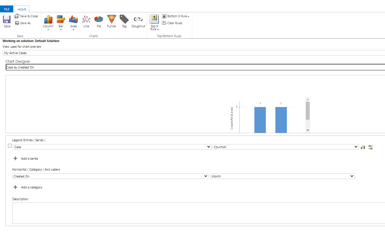
    Click Edit of the 'Monthly Stats-COD' chart, the chart editor will open in a new browser tab.

    pastedimage1607420947656v1.png    pastedimage1607420988323v2.png

    Go back to the D365 tab, click New. Then the chart editor will open in a new tab again.

    pastedimage1607421009205v3.png    pastedimage1607421055966v4.png

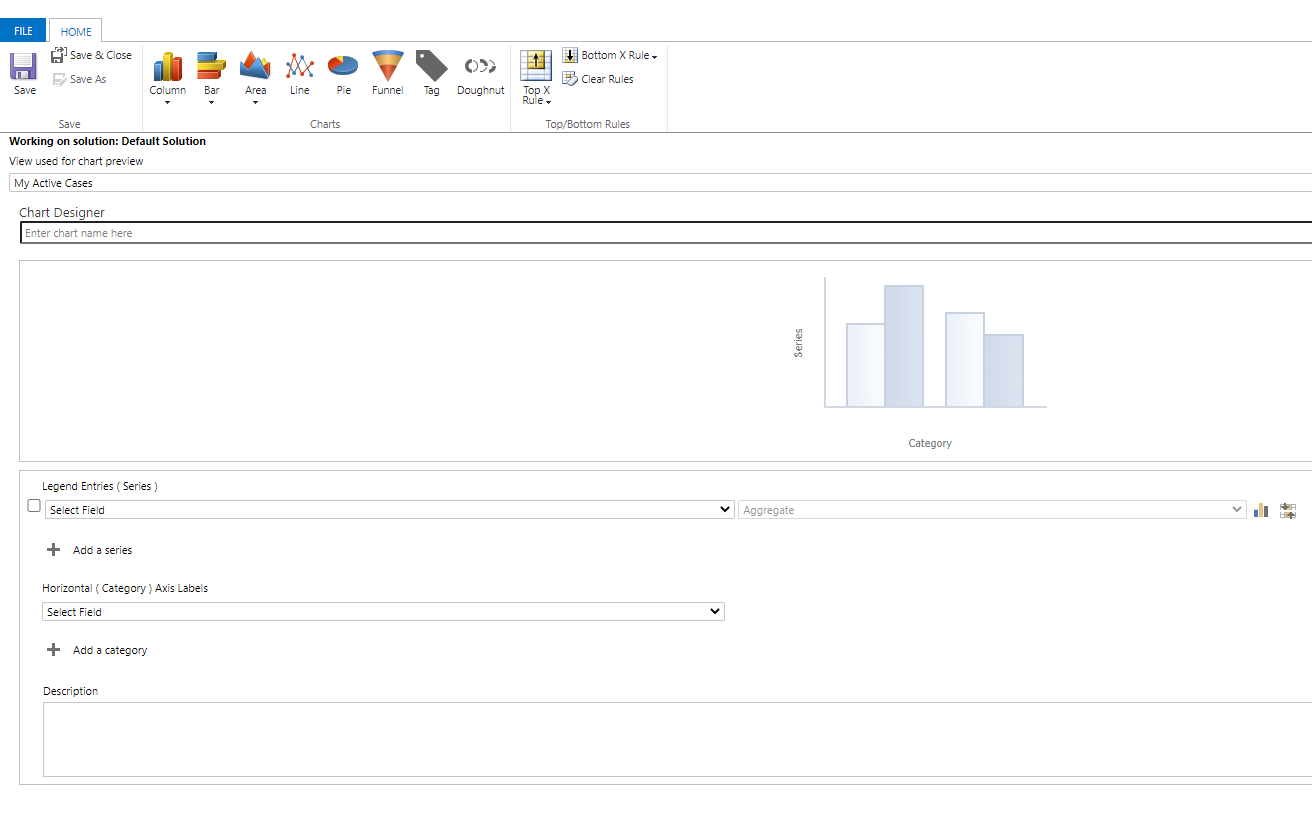
    According to the first chart editor, edit the second chart editor to make the Legend Entries (Series) and Horizontal (Category) Axis Labels of the new chart exactly the same as the existing chart.

    After saving the new chart, check whether the new chart has the problem you encountered.

Under review

Thank you for your reply! To ensure a great experience for everyone, your content is awaiting approval by our Community Managers. Please check back later.

Helpful resources

Quick Links

Responsible AI policies

As AI tools become more common, we’re introducing a Responsible AI Use…

Neeraj Kumar – Community Spotlight

We are honored to recognize Neeraj Kumar as our Community Spotlight honoree for…

Leaderboard > Microsoft Dynamics 365 | Integration, Dataverse, and general topics

#1
Siv Sagar Profile Picture

Siv Sagar 93 Super User 2025 Season 2

#2
#ManoVerse Profile Picture

#ManoVerse 80

#3
Martin Dráb Profile Picture

Martin Dráb 64 Most Valuable Professional

Last 30 days Overall leaderboard

Product updates

Dynamics 365 release plans