


Tip #497: Avoid multi-column sections if using mobile

 Like
Like Share
Share
 Report
Another awesome TIL from Scott “Captain Redlaces” Sewell.
tl;dr
Avoid multi-column sections on your CRM forms. (If you’re going to use the Mobile Apps)
Today I Learned
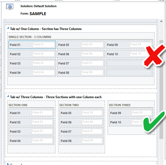
If you’re going to use one of the mobile apps in your implementation, avoid using multi-column sections – the layout of these fields will be significantly different from the Web app.
Use multiple column Tabs with multiple sections – rather than a single-column tab with multi-column sections. (Multi-Column sections display in a different sequence (across then down) on the tablet apps and create a ‘mixed-up’ view of the section.)
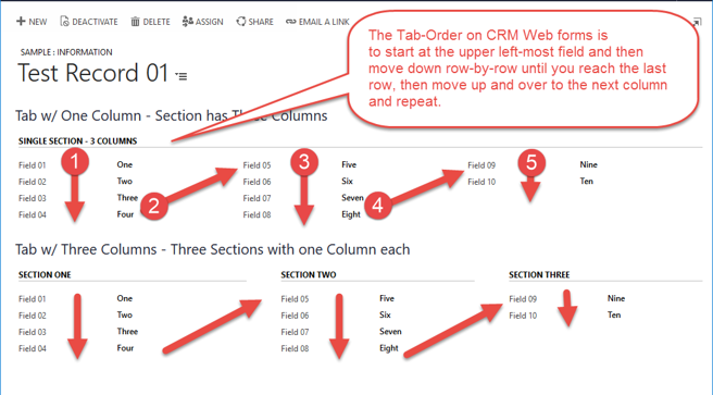
Here’s a view of a sample record in the Web Form showing the Tab-Order.
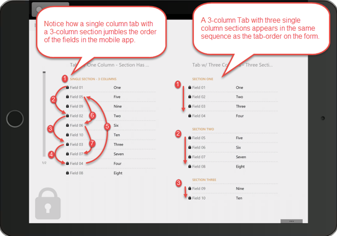
Here’s the same form in the Tablet App – notice the how the Tab with 3 Columns translates better to the app’s default layout.
This was originally posted here.
*This post is locked for comments