In this blog post let us go through the list of components available out of the box in the Power Pages.
Available Components are;
- Sections
- Text
- Button
- Image
- Video
- Spacer
- Power BI
- List
- Form
- Frame
Before we see how Power Pages components look like let us see what the modern SharePoint page Section and adding a Webpart looks like. Below are the pictures from both modern SharePoint and Power Pages.
If you are familiar with modern SharePoint, then you might have realized that both are looking similar. Otherwise please be informed that both the application components setup screen are having similar look and feel.
Microsoft is making sure that end users, and pro developers should not feel that altogether there is a different product, and something needs to be learned to utilize.


Now let us start with individual components
Sections
Sections are nothing but a placeholder to hold the other Power Pages components and to define the Page Structure
- How to add a section
- Go to a Power Page
- Hover over any editable canvas area, and then select the plus sign (+)
- Select one of the sections type out of 6


- To set/change the Section background color

- To set/change the Section background image
- Click on “Background” -> Image -> Add an Image
- To select the existing image, click on “media library”
- To upload a new image, click on “Upload Image”
- Select an Image to set as a background
- Click OK
- Check the background image set as a background of the section

- To change the page layout -> click on Layout

- To align the Content of the page section à click on the alignment icon

- To align the section style -> click on the settings gear icon

- To move & remove the section à click on the “…” icon

Text Component
Text component is used to add Text to the pages within a section
- Go to a Power Page
- Hover over any editable canvas area, and then click on the “text” icon
- Different options can be seen on the below page

Button Component
The button component is used to add buttons to the pages within a section
- Go to a Power Page
- Hover over any editable canvas area, and then click on the “button” icon
- Different options can be seen on the below page

Image Component
The image component is used to insert images to the pages within a section
- Go to a Power Page
- Hover over any editable canvas area, and then click on the “image” icon
- Different options can be seen on the below page

Video Component
A video component is used to add a video to the pages within a section
- Go to a Power Page
- Hover over any editable canvas area, and then click on the “video” icon
- Different options can be seen on the below page

Spacer Component
Spacer component is used to add space between two sections
- Go to a Power Page
- Hover over any editable canvas area, and then click on “spacer” icon
- Different options can be seen from the below page

Power BI Component
Power BI component is used to add PBI Reports to the pages within a section
- Go to a Power Page
- Hover over any editable canvas area, and then click on “Power BI” icon
- Detail setup of this component will be covered in a dedicated upcoming blog post
- Different options can be seen from the below page

List Component
A list is a data-driven configuration used to render a list of records without the need for a developer to surface the grid in the portal. Lists use Dataverse views to display records on the portal. A list displays data in a grid view on Power Pages sites. Lists on pages are created from Dataverse table views
- Go to a Power Page
- Hover over any editable canvas area, and then click on “list” icon
- Detail setup of this component will be covered in a dedicated upcoming blog post
- Different options can be seen from the below page

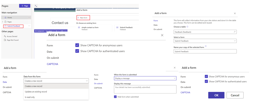
Form Component
A form is a data-driven configuration that collects data in Power Pages sites. Forms on pages are created from Dataverse table forms
- Go to a Power Page
- Hover over any editable canvas area, and then click on “list” icon
- Detail setup of this component will be covered in a dedicated upcoming blog post
- Different options can be seen from the below page

iFrame Component
iFrame component can be used to embed a webpage of other websites to a Power Page
- Go to a Power Page
- Hover over any editable canvas area, and then click on “list” icon
- Different options can be seen from the below page

In the next episode let us see how we can set up Authentication to a Power Page site to secure.
Happy learning!!!


 Like
Like Report
*This post is locked for comments