Yesterday, 2nd May 2016, was a great day for the entire GP community. GP 2016 was released and needless to say, it’s awesome. Unexpectedly stable for an RTM release.
Gone are the days when people used to fear about the RTM version, anxiously waiting for someone to find bugs, for Microsoft to release hotfix or a service pack and then implement/upgrade.
After playing around for good amount of hours on both rich client (read as desktop client) and the newly developed web client, I can assure you that GP2016 is ready, raring to go and can be implemented right away. Well, that’s just my opinion.
There are some great things about the new web client:
- It’s Fast & Responsive: HTML5 indeed has an extraordinary impact on the web client. It took less than 10 minutes to install and configure the web client (single machine configuration). And it took less than a minute to log on to a company. Absolutely NO PLUGIN dependency. Login was smooth, fast & hassle-free.

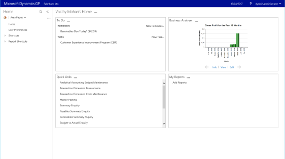
- Major UI & Accessibility Changes: All the windows have retained the good old GP UI. However, the home page has changed drastically.
- We have got the new (in)famous hamburger menu. Some people hate it to life. However, I did feel like it’s quite handy. That’s just me. Please don’t ban me from the community for liking it.
- There is a new way of expanding and shrinking the Navigation Pane. It is quite easy and intuitive to use. If I use GP on a small screen, like a tablet, this would come handy. That’s where the new hamburger menu scores well.

- That famous pencil button on the home page widgets, that’s used to edit the content of the widget, is no more. It’s been replaced with a “…”, as shown below. It’s probably going to take some time to get used to this. However it’s in the best interest of GP to perform well.

- All windows are now aligned to “Top-Center” on the browser. I could think of one reason for this behaviour: to ensure that it’s rendered uniformly across all kind of devices. I could see the way GP behaves on the browser, resizing itself quite happily to whatever the size the browser window takes. Below are some rendering:


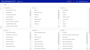
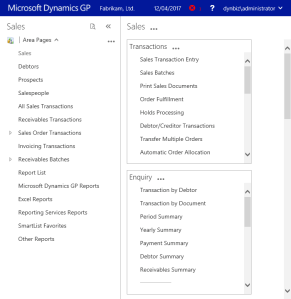
- Overall UI Rendering: UI (Home Page and other modules’ home page) responds exceptionally to the browser size. Even the fonts become smaller or bigger depending on how you resize your browser. Below are snapshots:


- Application Notifications: This one’s brilliant, in my opinion. All application related notifications (such as app errors, warnings, etc) are now shown to users in a non-intrusive manner as shown below:

When I click on that “Details” button, I get the following message that could be dismissed and I continue with my work without crashing GP:

So, as you can see, I have already got my first web client error in GP 2016 Web Client. However, I don’t think it is worrisome. I do believe I know why that error was popping up, so all good.
Now let’s talk about some issues, that in my opinion is a bit worrisome:
- Rearranging/moving Windows: This one’s kind of big, however I am not sure if it would be a deal breaker. Remember how we can open multiple windows in GP, arrange them side ways, do some multitasking, etc.? Now that’s probably not possible with the new web client. As you can see below, once a form is opened, you cannot access the home page or module page, until you close the active form:

As you can see, the background to “Debtor Maintenance” window is greyed out. I cannot move the active form either. You would however be able to use the windows that originate from “Debtor Maintenance”, such as “Payment Terms Setup”, as shown below:

However, you won’t be able to open a totally different form/report, such as Smartlist. In fact, unless you close the “Payment Terms Setup” window, you won’t be able to use “Debtor Maintenance” back.
In a way, this is great. You would maintain the sequence of your tasks. But if you are someone who would love to enter a PO and an SO simultaneously, I am afraid you are gonna get pissed off with the new web client.
You cannot also move windows from “Top Centre” position. Even if you try to do that, it’s probably going to be like below:

Yeah, well, it’s just that the window looks like nothing more than a web page and when you try to drag the window, it considers that you want to select content and thereby above rendering.
I would probably not panic about this. Whole idea of this new web client is to provide an app client that would work well across all kind of devices. If I access GP on an iPad, I won’t be worried about rearranging the windows or multitasking. I would be more concerned about how quickly could I complete my tasks and how easily I can work on.
I still have to play around a lot, however, these are my first thoughts about the new GP2016 HTML5 Web Client.
GP Team has done an excellent job to rewrite the web client. Considering this being the first ever HTML5 web client version, I totally believe that this is only gonna get better with every release.
Hats off, GP Team. Keep up the good work and continue to amaze us.
VAIDY
Filed under: #MSDYNGP, Dynamics GP, Dynamics GP 2016, GP, GP 2016, GP Web Client, GP2016, HTML5, Microsoft Dynamics GP, Microsoft Dynamics GP 2016, Web Client


 Like
Like Report
*This post is locked for comments