


 958
958 Like
Like Share
Share
 Report
Themes in Model-Driven Apps:
Introduction
When a new Dynamics 365 environment is created, it looks very standard: a top ribbon with white text over a black background and nothing more.

But thanks to Themes, it's possible to spice things up a little a customize the appearance of your Dataverse environment ,and made it represent the visual chart of the company. A very standard example is to personalize the CRM by adding the company logo in the top left (replacing the Dynamics 365 text).
Note that themes are applied globally throughout all model-driven apps.
Presentation
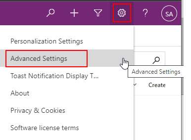
From any model-drive app, select the gear icon on the top right et choose Advanced Settings.
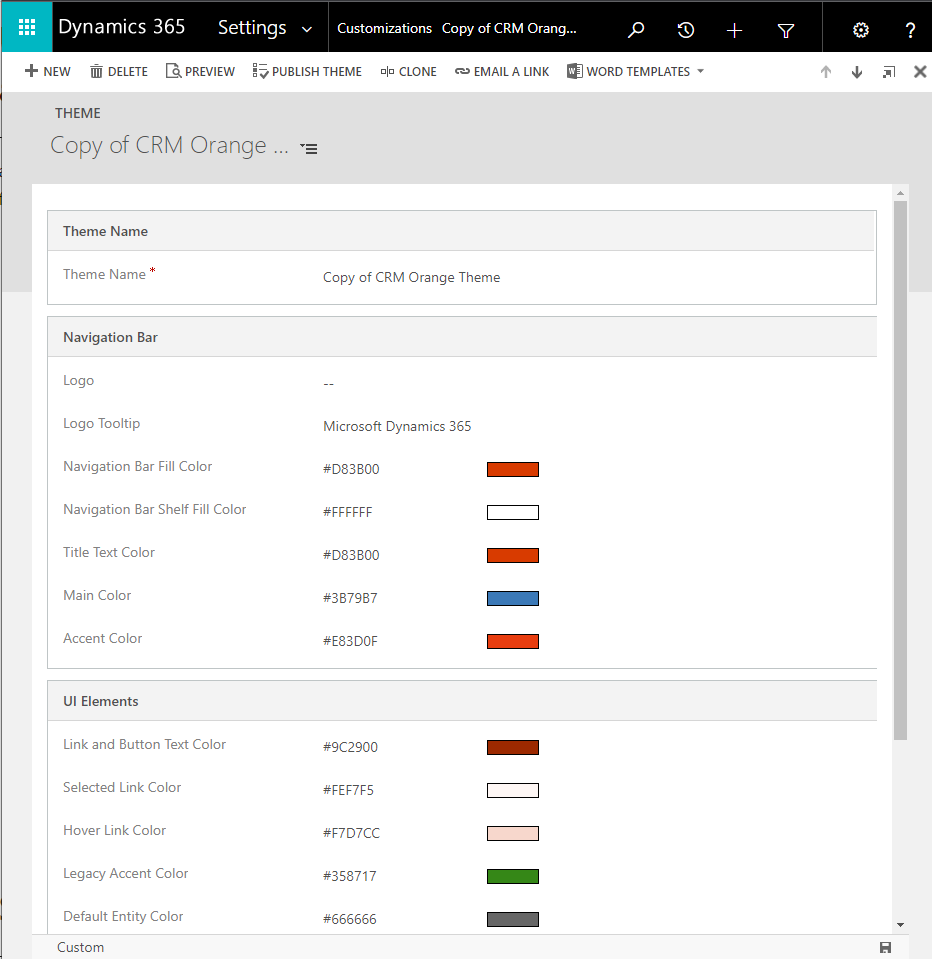
From there, navigate to Settings > Customizations > Themes. A list of available themes will appear. From there, it is possible to select and edit an existing theme, clone an existing theme, or to create a new one from scratch.
Note that a the time of writing this article, the Themes are only visible through the classic interface.
By default, three themes are installed: CRM Blue, Default and Orange Theme. Those themes are read-only and cannot be modified. But they can be cloned and the clones can be edited.
Below, a copy of the CRM Orange Theme as been created. Several visual elements from the UI can be modified here. From the documentation, the elements are:
-
Change navigation colors to create product branding.
-
Adjust accent colors, such as hover or selection colors.
-
Provide table-specific coloring.
-
Logo. (Use an existing or add a new image file as a web resource.)
-
Logo tooltip.
-
Navigation bar color.
-
Title text color.
-
Selected link color.
-
Hover link color.
-
Legacy accent color (primary background for process controls).
-
Default color for tables.
-
Default custom tables color.
-
Control fill color.
-
Control border color.
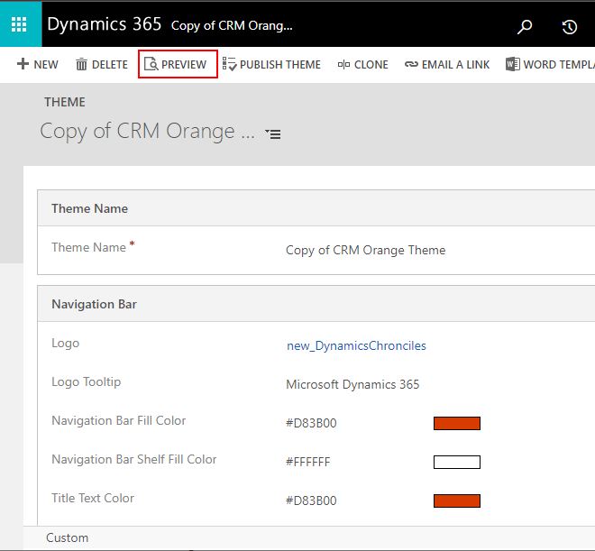
Before publishing a theme and making it available for the entire organization, customizers have the possibility to first preview it. For example, if a logo is added to the copied theme above, customizers can use the Preview button to see the changes. FYI, logos that are too large won't display. Microsoft recommends images with 156 pixels wide x 48 pixels height.
Once the Preview mode is enabled, a button Exit Preview is displayed in the Themes list and in every theme record.
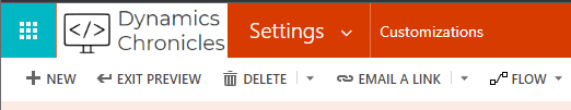
Note that at the time of this article, it wasn't possible to preview a theme in a model-driven app. The only way to see the theme is to use the Publish Theme button.
Solution
If you want to copy/paste and theme from one environment to another, just add the theme in a solution, like any other component. In the new environment, the theme needs them to be selected and published.
*This post is locked for comments