Hi Guys,
I know i have posted this previously, but i am still searching for the answer please.
I am trying to create a Chart in a report for Microsoft Dynamics CRM 2015 Online. I am using SQL Server Data Tools for Visual Studio 2012.
I have an entity that holds the records of every Presentation carried out by an organisation. On each "Presentation" record, there are two lookups to the contacts entity holding details of the two individuals who carried out the presentation;One lookup for "Presenter A" and the other for "Presenter B".
So, for example, over the course of a year...
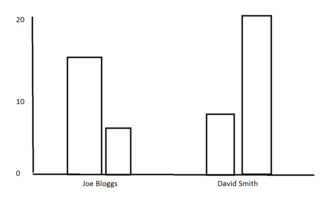
- Joe Bloggs has been "Presenter A" for 12 "Presentations" and recorded as "Presenter B" for 3 "Presentations"
- David Smith has been "Presenter A" for 5 "Presentations" and recorded as "Presenter B" for 18 "Presentations"
What i am trying to do is create a chart that shows this information. I am trying to get it something similar to this crude drawing...
Any help is GREATLY appreciated!
Thanks
Joel
*This post is locked for comments
I have the same question (0)


