Hi Graham,
Could you share me screenshots of your custom marketing email for both desktop view and mobile view?
What's mobile device do you use? Did you view it directly on browser or some client application?
Compatibility among different devices, browsers or client softwares are different,
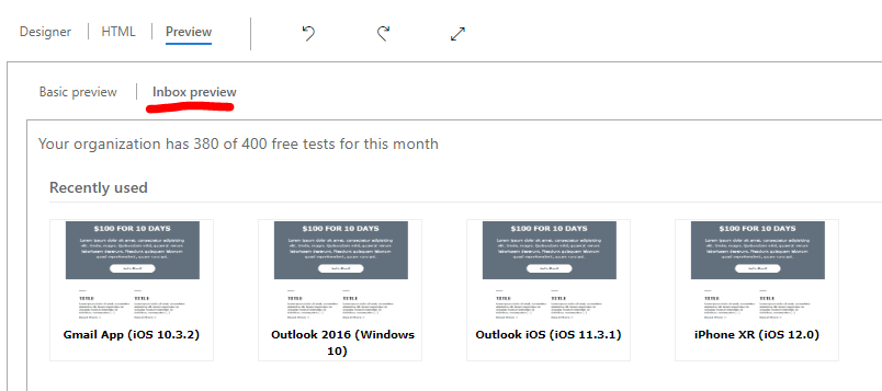
you could try to test your custom email preview with Litmus preview feature:
To reproduce your issue, I also created an email, send both the customized and a default template to test,
found that the looking issue you described happened on Outlook client.
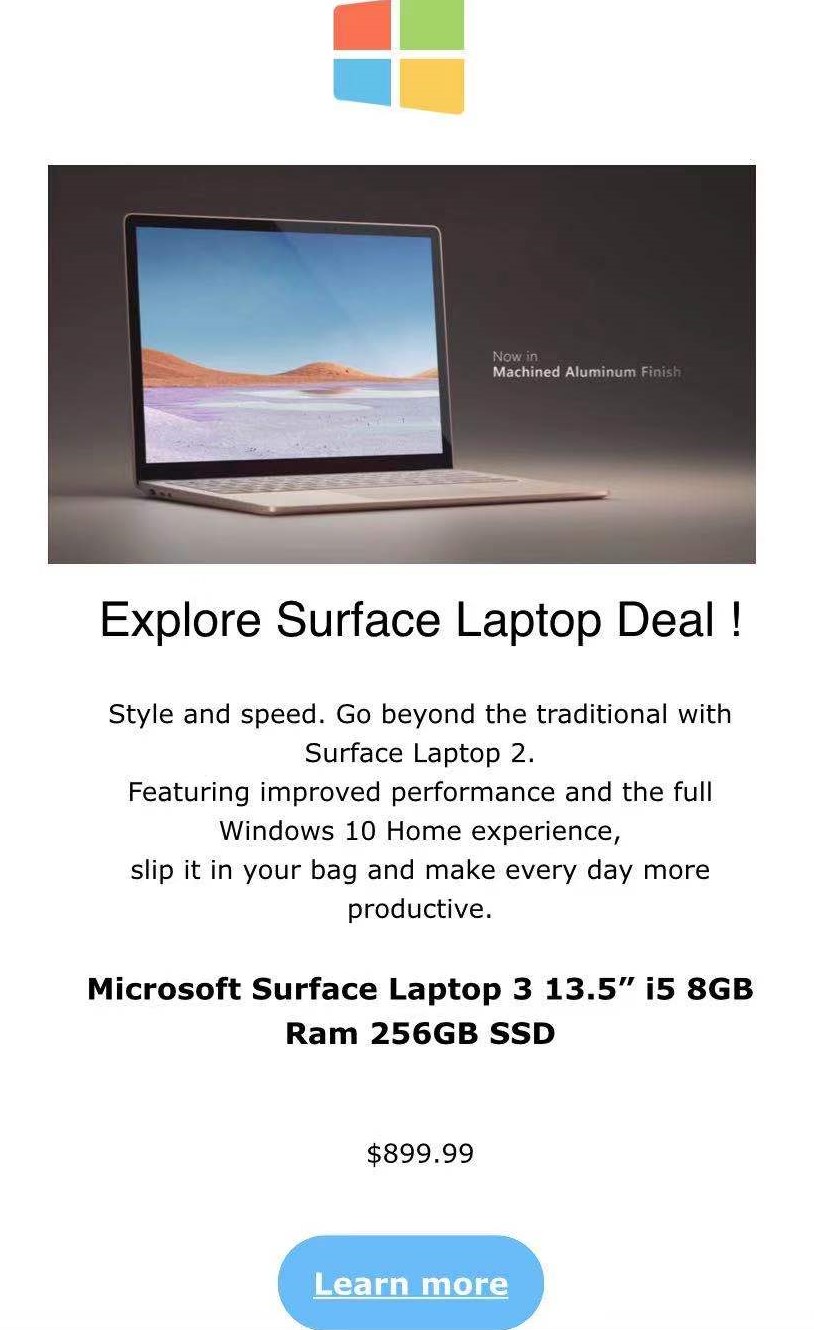
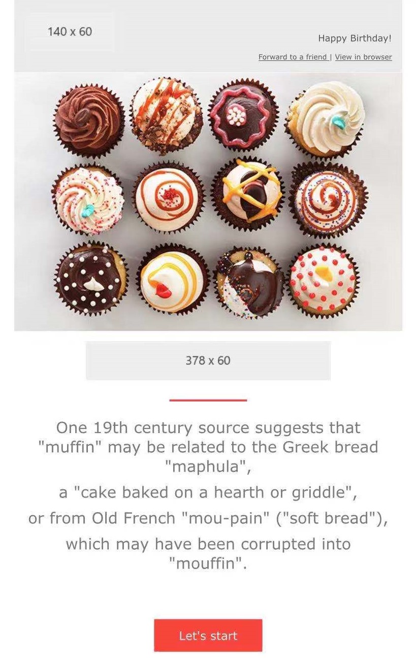
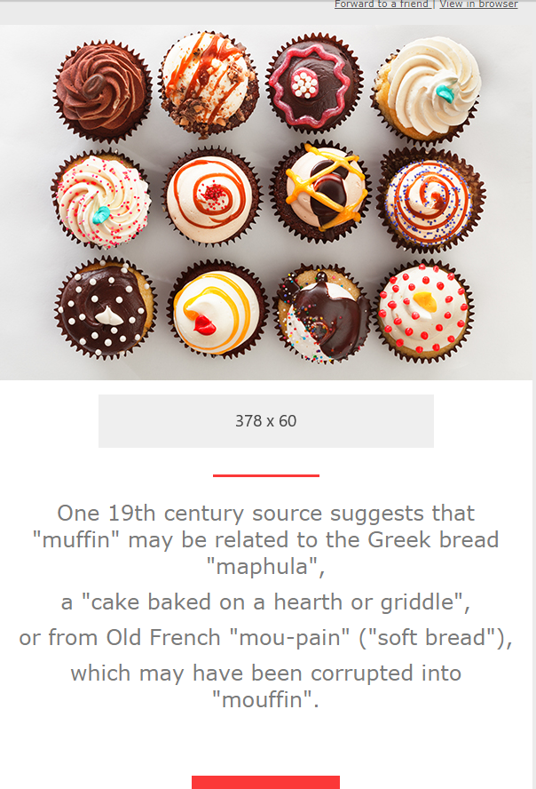
Custom email on Yandex.(Chrome, iOS)
It has same look as desktop preview.
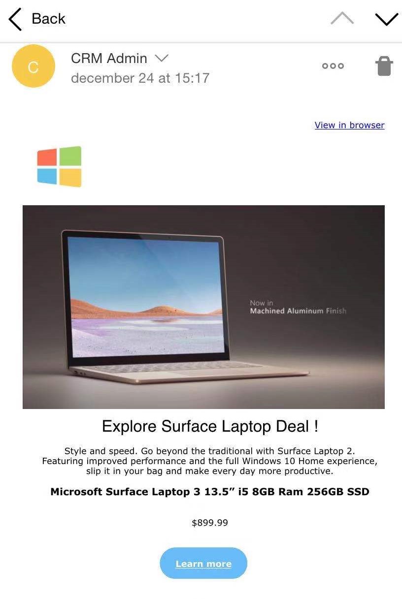
Outlook(app, iOS)
It looks like that font size is smaller in Yandex mobile view than Outlook app.
and sentences have broken across two lines due to it had exceeded outer container.
So it is just my thought, your issue would be that font size of text and sentences is large than container space, which caused break line behavior.
So could you also share me about which template did you use?
I tested for ercolano:
Yandex.(Chrome, iOS)
Outlook(app, iOS)
Desktop:
Now they have same look,
because there are enought space to keep sentence in one line,
however, it was still required to break complete sentence to keep marketing email responsive among different clients.
So in my thought, you could make text and sentence to be properly small to get responsive look.
Please point out whether I have understood your issue correctly.
If not, please share which template you had used and your custom email source code if possible, thanks.
Regrads,
Clofly