web
You’re offline. This is a read only version of the page.
close
Skip to main content

Notifications

Announcements

Community site session details

Community site session details

Session Id :
Microsoft Dynamics CRM (Archived)

Duplicate Colours on Charts

(0) ShareShare
ReportReport
Posted on by

Hi,

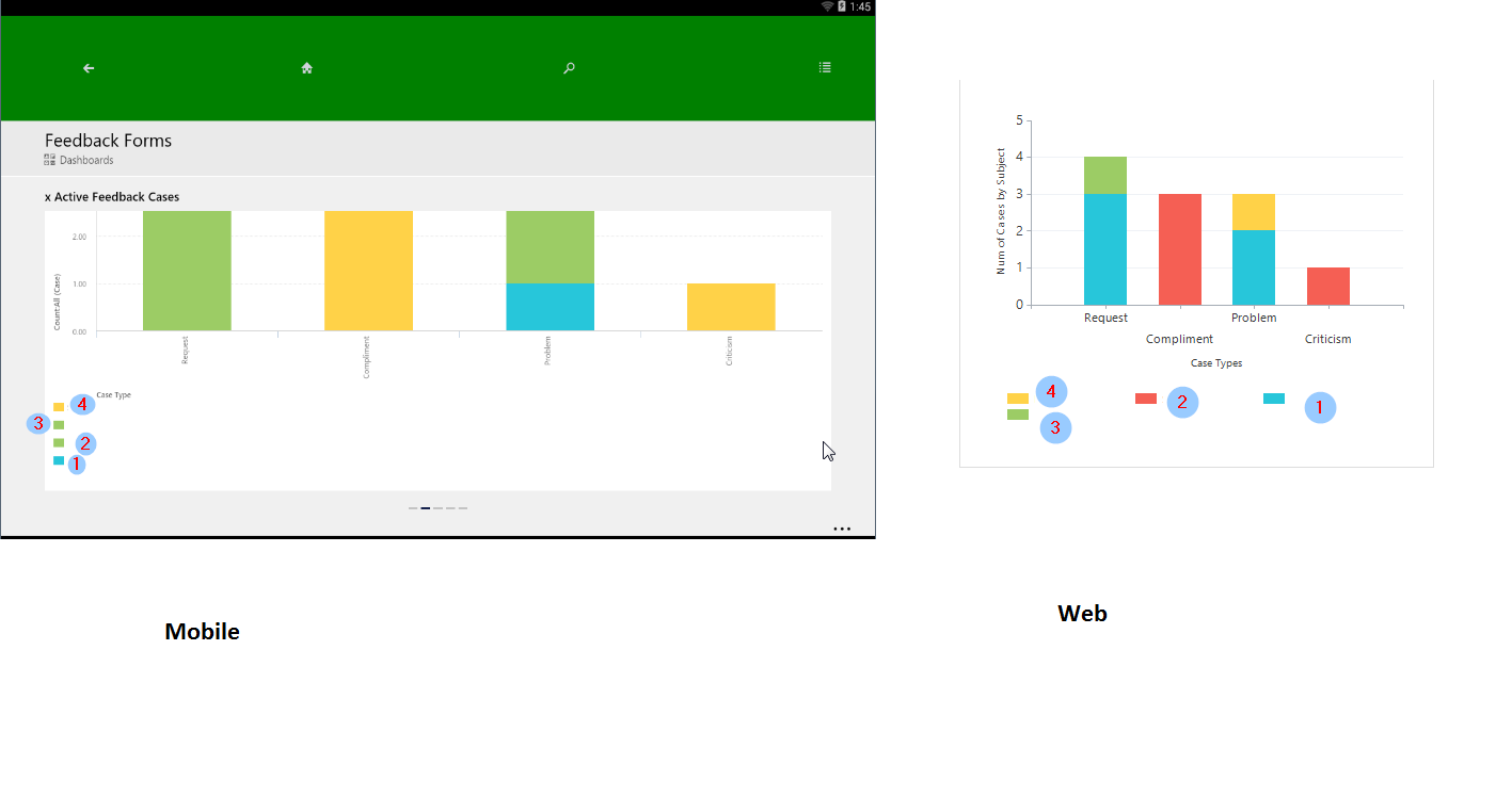
When using charts for dashboards on a mobile app(android and iOS), a stacked bar charts that supposes to display data using different colours, in real, replicates a same colour several times(the green one in the screen below), while in a web client the chart is displayed as expected. In the screen below, on a mobile UI,  I'm missing "red" colour, but have a green twice.

mobile-chart.png

Have anyone experienced the same behaviour?

Thanks,

*This post is locked for comments

I have the same question (0)
  • Community Member Profile Picture
    on at

    Hi

    Just experienced the same, It also show the same result if you preview both tablet and telephone in customizing. But.. not this behaviour on all dashboards. Have you got any further?

  • MaxNik Profile Picture
    on at

    As this problem occurs only when I use multiple series, so to bypass it I'm just trying to use a single series, then it works.

Under review

Thank you for your reply! To ensure a great experience for everyone, your content is awaiting approval by our Community Managers. Please check back later.

Helpful resources

News and Announcements

Season of Giving Solutions is Here!

Quick Links

Responsible AI policies

As AI tools become more common, we’re introducing a Responsible AI Use…

Neeraj Kumar – Community Spotlight

We are honored to recognize Neeraj Kumar as our Community Spotlight honoree for…

Leaderboard > 🔒一 Microsoft Dynamics CRM (Archived)

#1
Shidin Haridas Profile Picture

Shidin Haridas 2

#2
Abdullah13 Profile Picture

Abdullah13 1

Last 30 days Overall leaderboard

Featured topics

Product updates

Dynamics 365 release plans