Prepare the Data
For this example, we will work on a new workspace that will include only the assets needed for custom reporting. It is also possible to work from the workspace and lakehouse created during the integration enablement. Whether to store the entities and the analytics data in one or in separate lakehouses depends on your scenarios.
From the Fabric homepage, using the left hand navigation, open the list of Workspaces and click the button to create a New Workspace and give the new Workspace a name:
In the newly created workspace, create a new lakehouse. The option to create lakehouse may appear under the “More Options” when creating assets in the workspace.
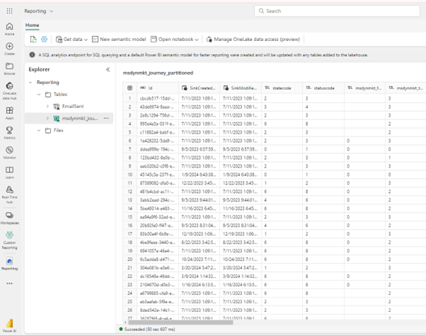
In this newly created lakehouse, shortcuts will need to be created for the tables that are going to be needed in the report. For the purpose of our report, we will need two tables: Email Sent table from the interaction analytics and journey (schema name msdynmkt_journey_partitioned) from the CDS tables. The CDS tables are visible under the CDS2 folder.
The below screenshot shows the addition of the Email Sent table.
Once both tables are added, the lakehouse will look similar to this:
Aggregate Data
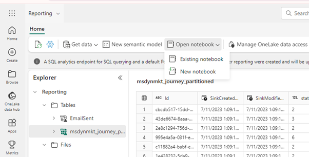
With the tables ready, the next step is to create a Notebook to aggregate data reflective of how it will be needed in the reporting. A Notebook is the place where you would create scripts to aggregate the data and write it to your new Lakehouse. The Microsoft Fabric notebook is a primary code item for developing Apache Spark jobs and machine learning experiments (see How to use notebooks - Microsoft Fabric | Microsoft Learn). You can open a new or existing Notebook directly from your Lakehouse:
In a Notebook, you can create a query to join the Entities data with the Analytics. For each day, you will get the number of interactions which happened on that day. The following code is an example of how this can be achieved. Data aggregations are recommended for the creation of reports over directly querying the shortcut tables available in the lakehouse. Creating reports that directly query the shortcut tables will be less performant than reports working off aggregation tables.
Please note that the names of the Lakehouses, tables and columns may be different. A Notebook may also use information from multiple lakehouses, in which case the various lakehouses should be added using the Explorer
For our aggregation, the following script is used.
from pyspark.sql import functions as F
df = spark.sql("SELECT msdynmkt_name, CAST(Timestamp as DATE) as Day FROM Reporting.EmailSent JOIN Reporting.msdynmkt_journey_partitioned ON msdynmkt_journey_partitioned.Id = EmailSent.CustomerJourneyId")
result_df = df.groupBy("Day", "msdynmkt_name").agg(F.count("*").alias("EmailSentCount"))
result_df.write.mode("overwrite").saveAsTable("Reporting.EmailSentByDay")
Visualise the data
Once the aggregation table is created, it needs to be added to the Default Semantic Model, so that it can be used to visualize the data in Power BI.
- Open the Lakehouse with the aggregated data.
- In the top right corner, switch to SQL analytics endpoint:

- Switch to the Reporting tab:

- Open the Manage default semantic model view:

- In the window that appears, add the tables that you want to visualize to the default semantic model and confirm. Because all our reporting will be based on the aggregation table and we want to avoid reports created directly against the shortcut tables, only the table created by our Notebook has been selected to be added to the model.

- Once the default model is created, you can switch back to the Workspace, and in the context menu of your semantic model (the top entity under the Lakehouse), you can either create an empty report, or allow Fabric to create a report for you.

- If you choose to create an empty report, you will see the tables that you added to the default semantic model present in the Data part. For the demonstration purposes, let’s create a Line chart with the daily amounts of EmailSent data:

- Once we choose the type of visual, we can drag-and-drop the columns: the counts will go to the Y-axis, the Day will appear in the X-Axis, and the Journeys can be used on the Filter pane:

- The resulting visual may look like this:
Additional Material
As mentioned, this document is not intended to be a extensive guide in the use of Fabric. More information on Fabric and best practices can be found in:


