Taking a look at the new Fenwick logo

Fenwick has been in the IT industry for over 40 years. We started in Melbourne, supporting businesses Australia-wide, and now globally with our AppSource offerings. We felt it was time to launch a new Fenwick logo to represent us globally.
Our identity has always been centred around our founder, Peter Fenwick, and for us the Fenwick name has become synonymous with quality IT systems and business solutions.
We’re constantly expanding, including additional services and products to our rich solutions catalogue. We wanted to reflect that with a modern refresh of our 2000’s emblem and identity. We’re leaving the “Software” off to reflect the broader IT solutions we offer, and to reflect the day to day use of our name by both our staff and customers.
Introducing the new Fenwick logo
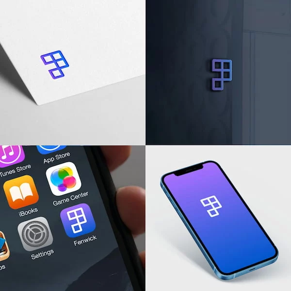
The final emblem design we settled on represents a few different things to Fenwick. It begins with a stylised “F” (something all our past logos have shared), represents our growing app “grid” & AppSource presence, and continues the “square” motif we’ve become accustomed to in our past logos.
Ultimately, it represents all the parts of the IT business solutions we put together daily, for you, our customers.
It’s a modern, versatile design that will work on multiple mediums and backgrounds; something our previous logo really struggled with. It looks great in white, blue, inverted, gradients, or even a seasonal palette.
We consider this a “sneak peek” as there will be more updates to our socials as we progress the rollout. We hope you enjoy the new logo as much as we do.
Finding Fenwick online
We’re excited to see this new take on our logo. If you see it pop up in places like LinkedIn, our website, and email communications, don’t worry, it’s the right Fenwick! The old logo may be around for some time as we work to update all the locations it’s come to call home.
The post Taking a look at the new Fenwick logo appeared first on Fenwick.
This was originally posted here.


 Like
Like Report

*This post is locked for comments