Platform 20 Brings Significant UI Changes to Dynamics 365 Finance and Operations
 Joel Leichty
Platform 20 was recently released and includes a number of noticeable changes to the User Interface; this article will highlight some of the significant changes. Overall, these changes are a welcome incremental improvement to some common usability issues.
Workspaces
Workspaces on the Default Dashboard are set apart from the background, making it more obvious they are buttons.
Old Button

New Button

Font Changes
Header fonts are bolder and use a heavier font than before.
Old Fonts

New Fonts

Ribbon Bar Color
Ribbon bar is now a more neutral color to blend better indicate the buttons are related to the form below.
Old Coloring

New Coloring

Fact Boxes
Opening the Fact Boxes went from an impossible to discover button to a “Related information” slide-out.
Old Button

New Slide-out

Filter Drop-down
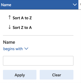
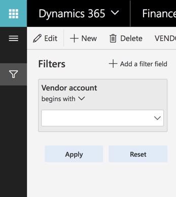
The grid filter drop-down and filter pane have been reorganized and enhanced.
Old Drop-down
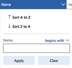
New Drop-down and Filter pane
Filter Slide-out Blends into Form
The filter slide out has new fonts, coloring that better blends into the form, and more obvious link indicators.
Old Filter Slide-out
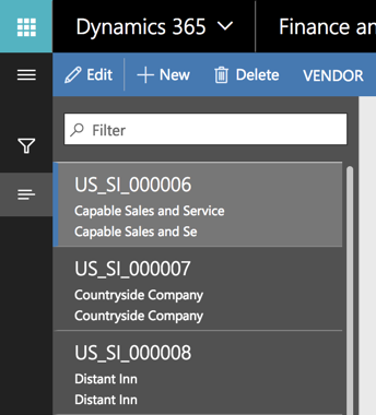
New Filter Slide-out
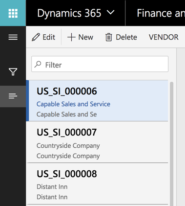
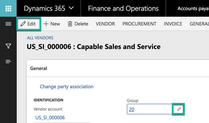
Edit Icon When Form in Read-only Mode
There’s now an edit icon on each field when a form is in read-only mode. This makes it more obvious for users to switch the form into edit mode.
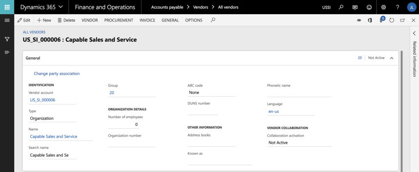
Subtle Field Outlines in Read-only Mode
Field boxes in detail forms are more subtle when in Read-only mode. Edit mode is similar to the prior design.


 Like
Like Report
*This post is locked for comments