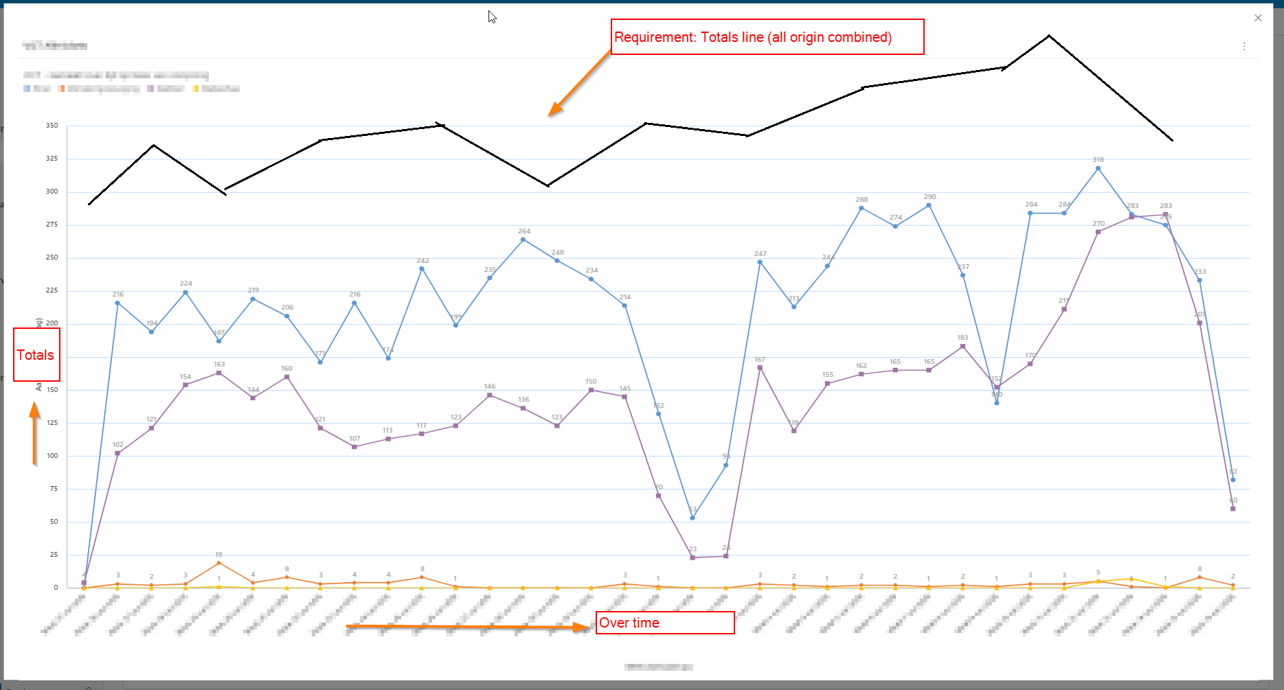
I have a business requirement to create a chart which can display the following information:
- Multiple Lines to represent the case creation totals grouped per line on case-origin (telephone, email, by mouth, portal etc.)
- A line that represents the case creation totals not-grouped
Both things are easily created in separate line charts, but i cannot figure out to combine these two. It would give us an excellent insight of the situation over time.
Here is an example of what we would like:
I have done some testing including XRMToolbox tools 'Advanced Chart Editor' and 'FetchXML Builder'. But I couldn't get the desired results.
Maybe somebody has some tips or guidance? Thanks in advance.


