We're using Dynamics 365 on-premises 8.2.25. With the latest Chrome and Edge updates, the formatting of the command button bar and associated grid button bar's have all become over-sized and skewed.

vs before the browser updates:
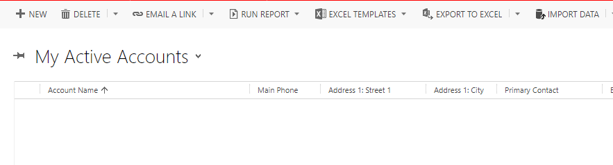
A noticeable decline in number of visible buttons, and slightly cut-off on the bottom.
Specifically, it looks like this rule is being inherited on the individual buttons (and to multiple levels of HTML) and wasn't before:
ul.ms-crm-CommandBar-Menu :not(ul.ms-crm-AssociatedGridCommandBar-Menu)
{
margin-top: 6px;
margin-left: 10px;
}
As far as I can tell, the browsers are fixing a bug as "space" :not should be a style for child elements and not the UL itself.
I suppose I'll have to open a case with Microsoft partner support. Wanted to start a thread if anyone finds a solution for making Dynamics look good again? I suppose we could edit /_common/styles/global.css.aspx.


