RE: Change Goals chart so a line appears rather than a circle for the target amount
Hi Jason,
Of course, this is possible.
Please follow the steps below:
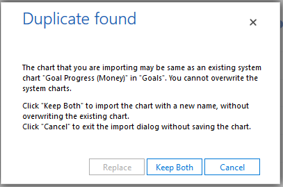
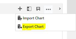
1. Export the chart. After this, rename the chart.
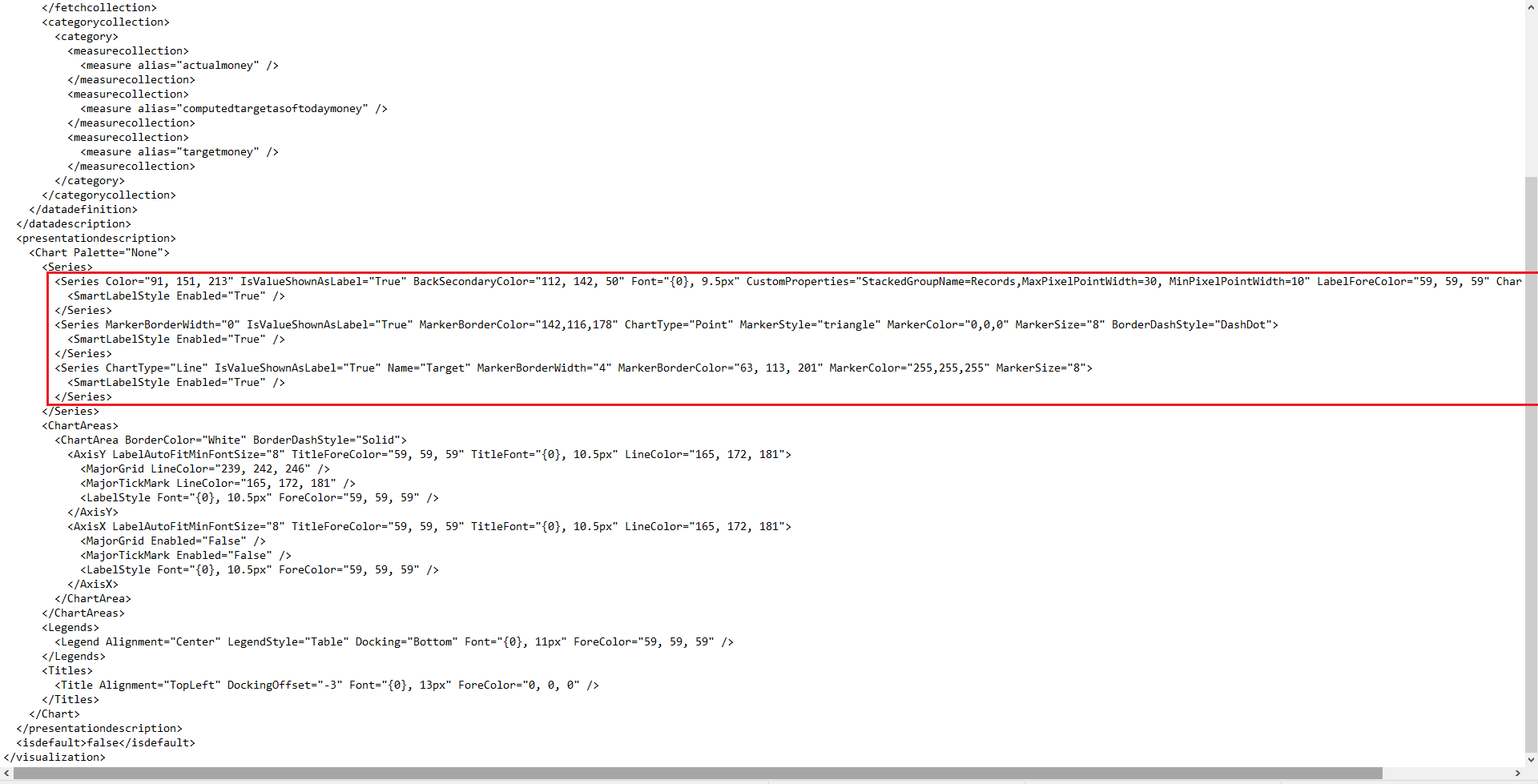
2. Open the XML file. Find <Series> and </Series> and modify the content between them to this:
<Series Color="91, 151, 213" IsValueShownAsLabel="True" BackSecondaryColor="255, 0, 0" Font="{0}, 9.5px" CustomProperties="StackedGroupName=Records, MaxPixelPointWidth=30, MinPixelPointWidth=10" LabelForeColor="59, 59, 59" ChartType="StackedColumn">
  <SmartLabelStyle Enabled="True" />
</Series>
<Series MarkerBorderWidth="0" IsValueShownAsLabel="True" MarkerBorderColor="142,116,178" ChartType="Point" MarkerStyle='triangle' MarkerColor='0,0,0' MarkerSize='8' BorderDashStyle='DashDot'>
  <SmartLabelStyle Enabled="True" />
</Series>
<Series ChartType="Line" IsValueShownAsLabel="True" Name="Target" MarkerBorderWidth="4" MarkerBorderColor="63, 113, 201" MarkerColor="255,255,255" MarkerSize="8">
  <SmartLabelStyle Enabled="True" />
</Series>
Please note that you need to delete MarkerStyle='Circle'.
3. Import the modified XML file into D365. If you want to keep the original chart, click Keep Both, otherwise click Replace.