Hi All,
I am buiding a dashboard for a support manager.
He wants a chart which shows the following:
- The number of cases per account (this worked); and
- He only wants the chart to show a top 8 (accounts with the highest number of cases).
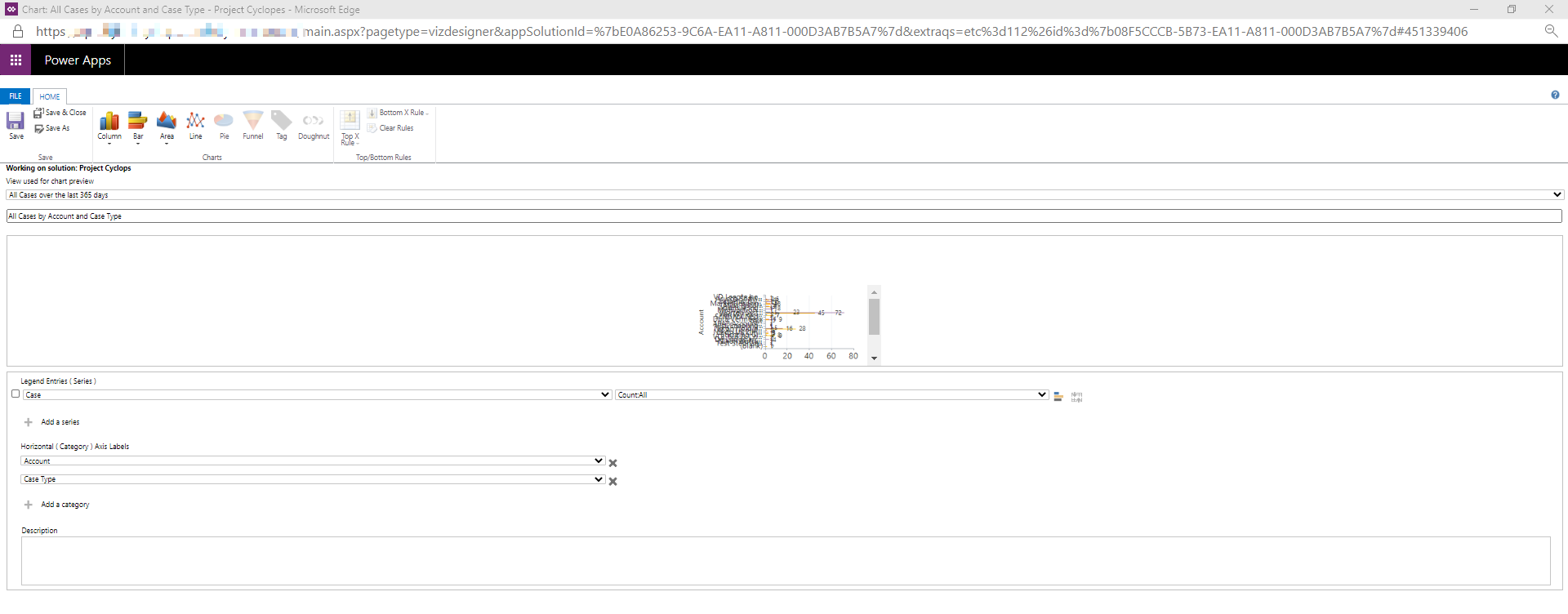
I am aware it is possible to create a certain ranking for sales entities (https://neilparkhurst.com/2019/02/26/mb-210-microsoft-dynamics-365-for-sales-sales-charts/) . However, when looking in the chart I created the buttons to apply the 'Bottom X Rule' and 'Top X Rule' appear to be disabled.
Is there maybe a way to enable these buttons? In order to give more context I added a screenshot of my chart designer as an attachment.
Thanks in advance for your help
Kind regards,
Stéphanie


