Hi Teh,
Yes, because number of components is limited.
To display more charts in dashboard,
a workaround is that creating our custom chart by 3rd party chart libraries such as Chart.js or Plotly.js, then add a large size web resource component with custom charts to the dashboard.
We could use aggregate FetchXML queries to get result that we want.
https://docs.microsoft.com/en-us/powerapps/developer/common-data-service/use-fetchxml-aggregation
e.g:
Create a same datasource as "Active marketing emails" chart by FetchXML aggregation parameters.
1. Download chart xml definition and copy the fetchxml from the file.
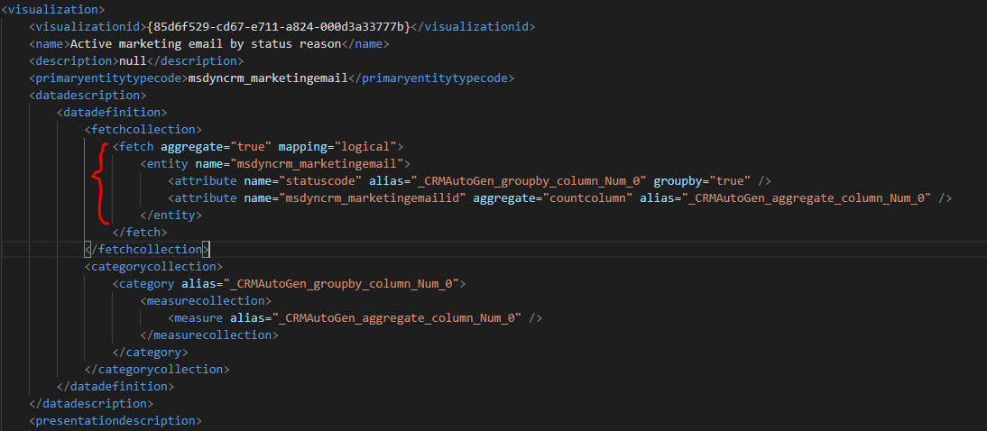
2. Change alias of attributes to what we want:

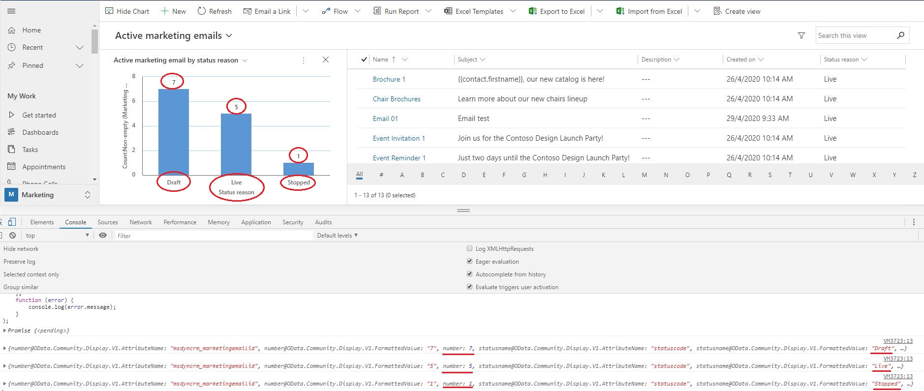
3. Run code above in console for test,
from output, we get a same datasource as default chart:
Then we could integrate it with Chartjs and display more charts in dashboard, because there is no limit in our own web resource.
Code:
var fetchxml = ''
      ''
      ''
      ''
      ''
      '';

var query = "?fetchXml="   encodeURIComponent(fetchxml);

Xrm.WebApi.retrieveMultipleRecords("msdyncrm_marketingemail", query).then(
    function success(result) {
        for (var i = 0; i < result.entities.length; i  ) {
            console.log(result.entities[i]);
        }
    },
    function (error) {
        console.log(error.message);
    }
);
Regards,
Clofly


