web
You’re offline. This is a read only version of the page.
close
Skip to main content
Community site session details

Community site session details

Session Id :
Power Platform integration forum
Under review by Community Managers

Under review

Thank you for your post! To ensure a great experience for everyone, your content is awaiting approval by our Community Managers. Please check back later.

Power BI - Automatics tooltips for line graphs

Posted on by
I'd like to change the way data is displayed in the automatic tooltips for line graphs.

It seems that Microsoft have applied a rule concerning the display of data in the automatic tooltips of curve graphs, but we don't have control over it.

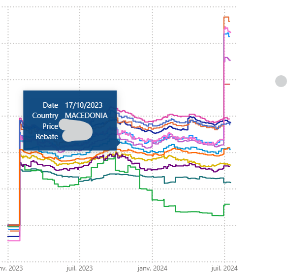
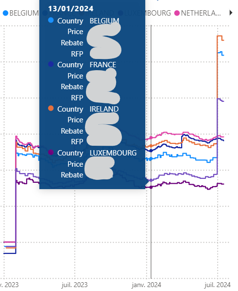
I've created a curve chart (x: date y:price) where I have as many curves as countries. If I select a certain year, and hover over one of the curves, I'll get a little label with the country's price. But if I select the whole period and hover over one of the curves again, I'll get a big label with the price of all the countries...

Can you explain the rule applied here? Is it possible to add options to change the way the tooltip is displayed?

Little label :                                                                           Big label : 

Helpful resources

Quick Links

November Spotlight Star - Khushbu Rajvi

Congratulations to a top community star!

Forum Structure Changes Coming on 11/8!

In our never-ending quest to help the Dynamics 365 Community members get answers faster …

Dynamics 365 Community Platform update – Oct 28

Welcome to the next edition of the Community Platform Update. This is a status …

Leaderboard > Power Platform integration

Last 30 days Overall leaderboard

Featured topics

Product updates

Dynamics 365 release plans